meta data for this page
Data visualization
We are investigating options of using Highcharts, Protovis, D3.js, Google Chart Tools, and other frameworks/toolkits for visualizing parametric results. If you would like to learn more about this development, please feel free to contact us.
Below are just a few examples. More will be added, soon.
Example application on Bio PCM
This example came from PhaseChange Energy Solutions (http://www.phasechange.com), showing the application of jEPlus and visualization on analyzing performance of bio phase change materials in buildings. It is an excellent demonstration of visualizing multidimensional data with sophisticate user controls. Data are backed by a Google spreadsheet.
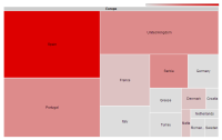
Tree Map Example
“Treemaps display hierarchical (tree-structured) data as a set of nested rectangles. Each branch of the tree is given a rectangle, which is then tiled with smaller rectangles representing sub-branches. A leaf node's rectangle has an area proportional to a specified dimension on the data. Often the leaf nodes are colored to show a separate dimension of the data.” - Wikipedia
This example shows a breakdown of Design Optimization Competition 2012 participants.
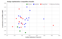
Scatter Plot Example
Here is an example of scatter plot created using Google Chart Tools API. When you move mouse cursor to any data points, formatted information about the the data point will be shown. This is done using Html tool tips. Data of this chart is backed by a Google spreadsheet. Google chart provides a range of data access, filtering, and user interactive features, which we are still experimenting.
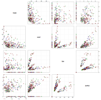
Matrix Plot example
Another excellent example of using Protovis (http://mbostock.github.com/protovis/) for visualizing multi-dimensional data set, in this case, the correlation between various energy consumption components of a collection of office buildings. Try select a region on any scatter plot, and see corresponding cases being highlighted on all scatter plots.
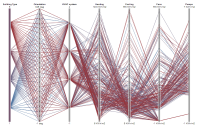
Parallel Coordinates Plot Example
Here is an example of what a Parallel Coordinates Plot looks like with building simulation data. You can try filtering data by selecting a region on a coordinate. This plot type is excellent for visually analyzing sensitive design parameters to given performance indicators.


