meta data for this page
Scatter Plot Example
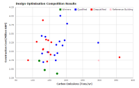
Here is an example of scatter plot created using Google Chart Tools API. When you move mouse cursor to any data points, formatted information about the the data point will be shown. This is done using Html tool tips. Data of this chart is backed by a Google spreadsheet. Google chart provides a range of data access, filtering, and user interactive features, which we are still experimenting.
Sample chart
(If the chart below does not show, please reload this page.)
<html>
<head>
	<script type="text/javascript" src="https://www.google.com/jsapi"></script>
	<script type="text/javascript">
		google.load("visualization", "1", {packages:["corechart"]});
		google.setOnLoadCallback(drawChart);
		function drawChart() {
			// get data from the google spreadsheet
			var query = new google.visualization.Query('https://docs.google.com/spreadsheet/pub?key=0ArvhzGK819TjdEdzamJoWWpqUlJRSDlONFlhRHpNaHc&single=true&gid=0');
			// Return columns B to J where D, F, H and J are tooltips
			query.setQuery('select B, C, D, E, F, G, H, I, J');
			// Send the query with a callback function.
			query.send(handleQueryResponse);
		}

		function handleQueryResponse(response) {
			if (response.isError()) {
				alert('Error in query: ' + response.getMessage() + ' ' + response.getDetailedMessage());
				return;
			}
		var data = response.getDataTable();
			data.setColumnProperties(2, {role: 'tooltip', html: true});
			data.setColumnProperties(4, {role: 'tooltip', html: true});
			data.setColumnProperties(6, {role: 'tooltip', html: true});
			data.setColumnProperties(8, {role: 'tooltip', html: true});
		var options = {
			width: 700,
			height: 450,
			chartArea: {left: 70, top: 35, width: '87%',height: '82%'},
			//backgroundColor: {stroke: 'black', strokeWidth: 2},
			fontName: 'Verdana',
			title: 'Design Optimisation Competition Results',
			titleTextStyle: {fontSize: 14},
			series: {0: {color: 'green', pointSize: 9}, 1: {color: 'blue'}, 2: {color: 'red'}, 3: {color: 'pink'}},
			hAxis: {title: 'Carbon Emissions [Tons/yr]', titleTextStyle: {bold: true, italic: false, fontSize: 12}, textStyle: {fontSize: 10}, gridlines: {count: 8}, viewWindow: {max: 400, min: 50}},
			vAxis: {title: 'Construction Cost [Million GBP]', titleTextStyle: {bold: true, italic: false, fontSize: 12}, textStyle: {fontSize: 10}, gridlines: {count: 9}, viewWindow: {max: 4.25, min: 2.25}},
			legend: {textStyle: {fontSize: 11}, position: 'in', alignment: 'end'},
			tooltip: {isHtml: true}
		};
		var chart = new google.visualization.ScatterChart(document.getElementById('chart_div'));
			chart.draw(data, options);
		}
	</script>
</head>
<body>
	<div id="chart_div"></div>
</body>
</html>
Discussion